
Since, my sweet Hubby was only going to be home for another week or so, (recuperating from surgery AND he was feeling so much better!) we decided to attack this problem.
We didn't want to patch the old holes.... that would just mean patching, mudding and SANDING... in other words a HUGE MESS!!!!! No thank you. So we decided to build a mini bulk head and correctly place the pendant fixtures. :)
Here is the plan drawn on the ceiling. You can see the circles for the new light boxes.

Then we cut those circles out. Now, you can totally see that the placement position is soooo much better!!

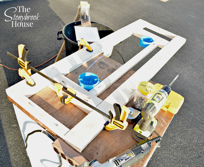
Hubby built a frame that was going to house the light boxes and hold up the pendant lights. He's so smart with configuring this kind of stuff. :)
We got that baby screwed into studs to give it the support it needs. Good Job, Honey!
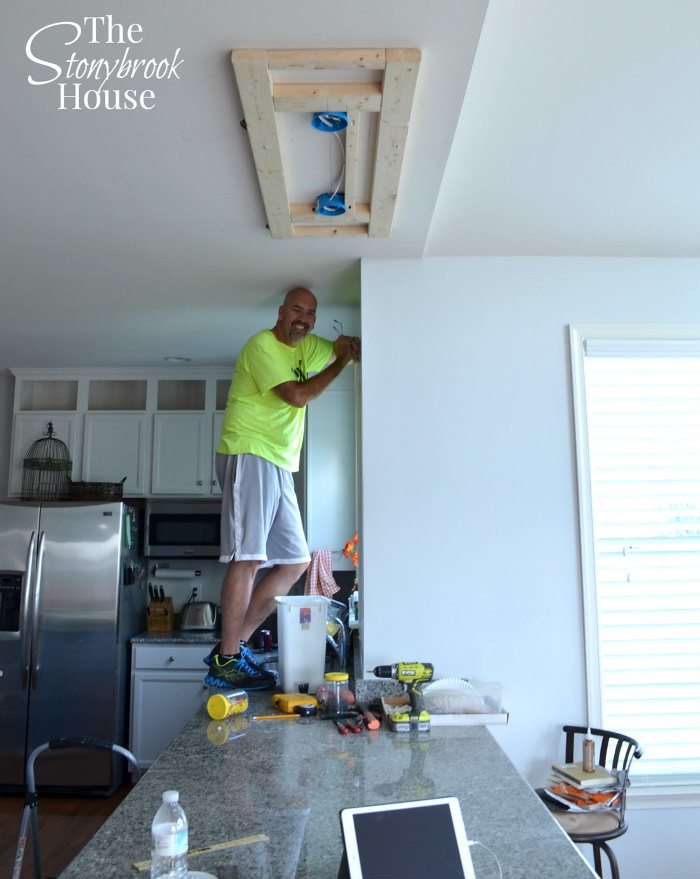
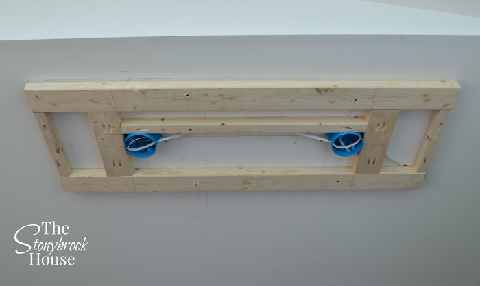
Here's a closer look. The light boxes are set in the holes, just a bit, to make them level with the bottom of the frame.
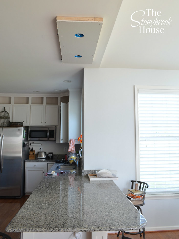
Here's the drywall that will be installed next. Hubs got it all ready before we installed it on the ceiling.

It's starting to look good! Next up.... patch the screws, a tiny bit of sanding, then some primer and crown molding.
Now, I thought that this would pretty much be it. Maybe a little caulking around the edge, but no....

This was not going to look good. Caulking just looked messy and unfinished. I did have to piece the crown molding at the corner, but no one will really be looking there. And... my miters weren't the best, but nothing like a little caulking to cover it up.

The solution, was to put a piece of small flat trim on the bottom to cover the edge. Now, it looks much better!!

Another view... Just need some paint and we'll be ready to rock and roll!!

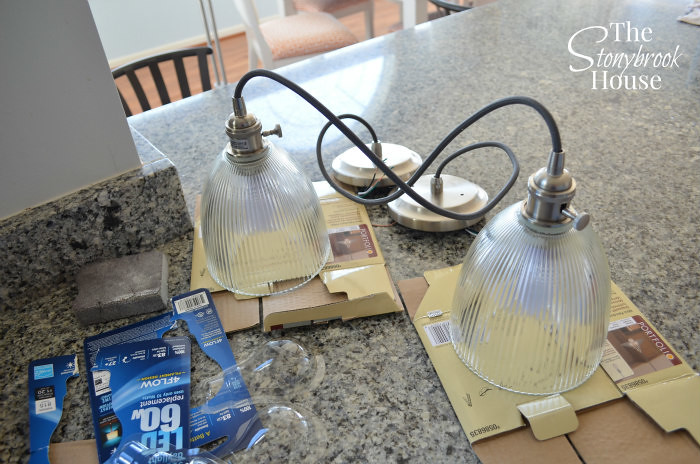
Here are the pendant light fixtures and glass shades we chose. Simple and classic. If we ever want to we can change the glass shades to something else, it'll be a easy.
Love love love this!!! It looks like it was meant to be there. It goes right along with the cabinets in the background.

And now we have light!! This has brightened up the whole space, kitchen and dining area.
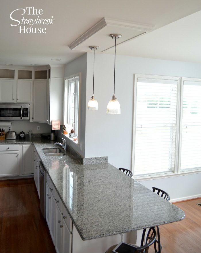
So, this is how we corrected our misplaced pendant lights. :)

Blessings,


Looks great. Has a custom feel now!! Good job :)
ReplyDeleteHi Eliesa! Thanks!! It works sooo much better now! Light everywhere!! :)
DeleteLooks beautiful Lori. I wish I could hire you for some projects around our house! Good to see you posting again. Nana
ReplyDeleteHahaha! Thanks, Nana! I need a kick in the pants to get writing more!
DeleteOMG. You guys are the most amazing DIYers!!! LOVE your blog. I just hope you posted more often, like everyday. ;)
ReplyDelete-Kez
Hey Kez! Thanks! IK.... I need to write more... It's just so hard to spend so much time on the computer! :/ Need to buckle down! Thanks for the encouragement
DeleteHello! Nice work! We are having our cabinets painted soon with that same paint. On a scale of 1 to 10 how much sanding did it require to get your canines ready?
ReplyDeleteI lightly sanded, I would say probably on a scale of 2-3. Not much really. The primer is the key! Thanks for reading!
Delete